design
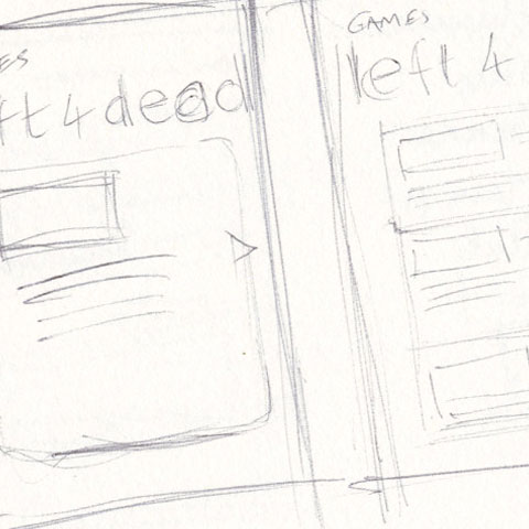
Early sketch during discussions with developer
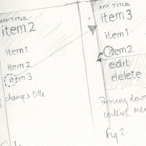
Sketch to gather feedback on context menu use
Rejected visual - too much use of rules and gradients
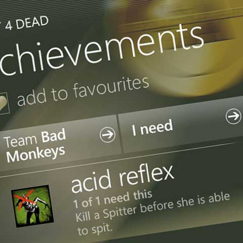
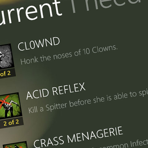
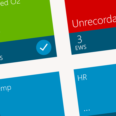
The achievement screen
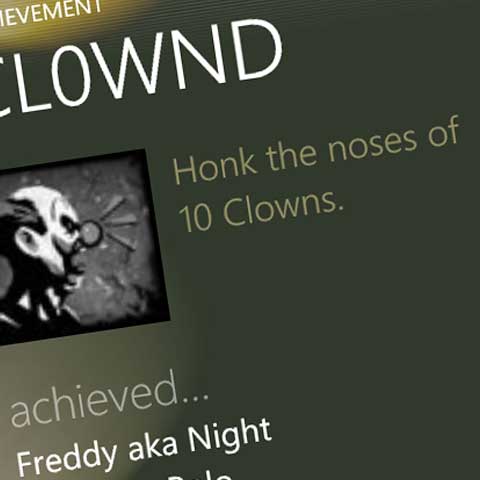
Steam Achievements Windows Phone app
An internal Clear Breeze Consulting project, Steam Achievements started life as an iOS app allowing Steam users to login, view their achievements and create teams from their Steam friends and attain outstanding achievements. We created a Windows Phone version in the early days of Windows Phone 7.
Challenges & approaches
- As Windows Phone was new to the market at the time we worked on Steam Achievements, we had to familiarise ourselves, designer and developer, with the controls, conventions and aesthetics of the platform.
- Creating branding that reflected the gaming market we were aiming at whilst still respecting the design principles of the Windows Phone platform proved quite a challenge. Ensuring that content remained unadorned by chrome: dropshadows, list adornments, 3d elements etc, required considerable discipline in the early days!
- Allowing for discoverability against presenting clear visual cues to users proved a dilemma. Context menus are a great example of this, especially when a platform is new and the conventions less established. We did use these kind of controls for quick access to functionality, but always ensured there were alternative journeys for the user.
- As the designer, I found myself constantly stripping down visuals. I removed as much unnecessary 'clutter' from the designs as possible in each iteration. This also applied to the user journey too - attempting to reduce the complexity of interactions as much as possible.
You can find more about the design and development of Steam Achievements by reading our article on the process.
Next project Return to home- Visual design
- XAML page construction & styling
- Asset creation