design
Designing for Steam Achievements, a Windows Phone 7 app
What's it all about?
This article is really a write-up of my experiences and processes working on my first design project for Windows Phone 7. I had some experience working with Blend on some small Silverlight projects in the past, so I was keen to carry on what I learned there and have a go at a mobile app. I worked closely with Paul Marsh, the developer who came up with the concept and did all the technical bits for the app. He had already written and released the app for the iphone, for which I did a tiny bit of design in the form of icons and splash screens. Hopefully he'll contribute some more technical bits at some point, but here are some of the design/UI dilemmas faced...
Steam Achievements, the app - moving from iphone to WP7
Steam Achievements is an app that has been out on the iphone for a year. The app has three main functions:
- in its basic form, it allows the Steam user to log in to their Steam account and view their game list and the associated achievements, both completed or outstanding
- it allows you to add your friends so that you can view their achievements
- it allows you to create teams from your friends so that you can all see which achievements you have outstanding to complete together
In addition to the way the iphone app performs, ultimately it is the intention to include several more features into the WP7 version of the app. However, as we worked through the process of designing and building the screens, we decided to limit the functionality for the initial release to reduce the development time so we could launch the app sooner.
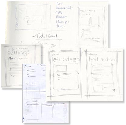
A few of the sketches that helped us organise the flow
We're not designing a desktop app...
Initially we had considered starting with a screen that enabled you to go to your teams page, view all your games or select a specific team or game. However, we eventually felt that this approach perhaps wouldn't work so well for a mobile application. The app needed to be more focused, more task-based. We were kind of approaching the problem from more of a desktop/website perspective where you tend to navigate through a set of choices, rather than considering the flow in greater detail.
Rejected design for a 'home' page - we were falling for the mistake of making a desktop app with navigation rather than focusing on the flow of completing smaller tasks
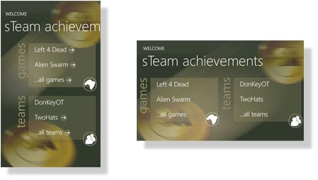
With this approach in mind, we deferred to the original iphone app. The app is only useful if you have a valid account, therefore the user is initially presented with a 'login screen'. Typically, logging in isn't as straightforward as it might be due to the way in which Steam provides user Ids. The process is rather convoluted and requires a number of steps to be carried out on the Steam web site. Rather than cram that information onto the phone UI we designed a dedicated wp7 web page to explain the steps. This is constructed as a straightforward HTML/CSS web page, hosted on my website. I made this page specific to Windows Phone by using the viewport meta attribute:
The help page for retrieving Steam Ids is a web page, optimised for Windows Phone 7 via the viewport meta attribute
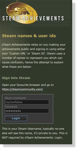
<meta name="viewport" content="width=320" />
This sets up the correct page width. To help maintain a consistent look and feel I created a background image taken from the Steam Achievement app.
De-cluttering and considering metro design values
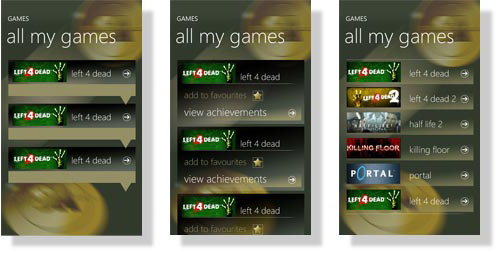
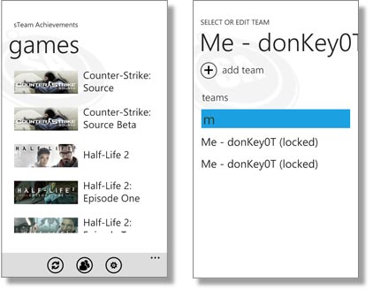
Once logged in, you are delivered a list of the games you own. The images of the games are important. They are instantly recogniseable to the user and allows he or she to key directly into the game. The aspect ratio of the game images is a little awkward to work with as their landscape orientation takes up a considerable amount of horizontal space when displayed at a legible size, leaving less space for the accompanying text title.
I really struggled to avoid using too much 'visual furniture' to support the content. I initially used a variety of techniques to emphasize each row - rules, gradients of transparent colours etc, but decided to omit these and simply allow space to separate each row. I wanted to try to adhere to the Metro design principles of allowing the content to shape the page, using typographic and layout techniques, rather than relying heavily on screen 'chrome'. I had to fight the instinct to make the screens look 'gamer-ish', using glassy, opacity layering and glossy imagery. I instead tried to convey an element of this with the background imagery and allowed for a more Metro approach to the actual screen content. I'm not sure this is necessarily the correct decision, but it was a constant dilemma - how much do I try to conform to the design principles of the native operating system and how much do I push the boundaries? Certainly for a first app or so, I felt it worthwhile really trying to absorb the essence of the Metro principles so that I have an understanding of when might be appropriate to consider working outside it.
Something I also found during this process, was that gradients didn't work well when created in Blend. I saw a considerable amount of banding on the device which really interfered with the legibility of the text (I understand this may be improved with the Mango update). Despite the decision to rely solely on vertical space to separate the content, it is the page I am least happy with. I do feel the screen is bland and lacks something so I am keen to address this in a future release.
Rejected designs for the games page:
- Using some kind of dropdown to reveal the achievements - too cluttered for the page
- Stating the obvious with words and icons 'view achievements' = unecessary
- Simplified, but is the row gradient really Metro? Is the arrow icon really adding anything?
Admiring the landscape
I also wanted to allow for landscape usability for all those poorly-neglected hardware keyboard users out there! I therefore had to ensure that the grid holding the list information adapted to the change in orientation.
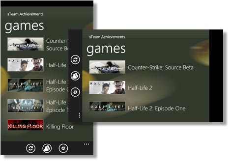
Released screen design - clutter stripped away, simply image and title
A pivotal moment
Once the required game is selected, you see your achievements displayed on a pivot. Initially we had all kinds of ambitions for this page which we hope to fulfil with extended features in later releases. However, additional features aside, we were still over-cluttering the screen with heavy buttons etc. and over-complicating the process.
Rejected achievement list page designs - shows the process leading to the released design:
- Pretty much a re-styled version of the iphone app
- Looking at using the game image but finding too much real estate taken up
- Trying to run 'achievements' title vertically to save space as too much on page
Re-jigging buttons and titles in an attempt, again, to reduce vertical space and gain more achievements per page. Also started to 'lighten' up the buttons and reduce the 'chrome' of the pages. Still finding too many options to features available on the one page.
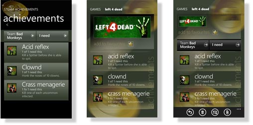
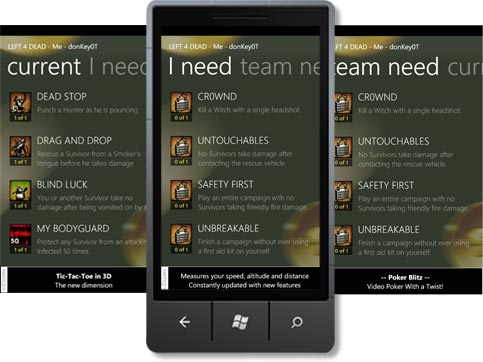
We therefore exploited the pivot in order to show different views of the data:
- a full list of achievements
- the list filtered to show those achievements outstanding
- the list of achievements outstanding to the whole team
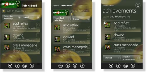
This is where the app differs the most from the iphone version - using the WP7-specific control (the pivot) to present the information in a different way.
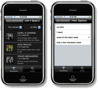
The iphone app relies on buttons to effect a filter of the data, via another screen
The same information is presented via a pivot control.
Words are important too
Much of the UI design relied on the copy - the terminology chosen to refer to the various features, as much as the visual flow. How do you describe in words some of the features your user might wish to explore? Do you 'gain' an achievement? 'Attain' it? 'Receive' it? How do you express that a team has outstanding achievements when space and attention span is limited? You can't use reams of copy to explain what you mean, no-one has time to wade through that. A user will download an app (especially if it's free), try it out and if they hit any resistance, will no doubt reject it. Apps are bubblegum. We struggled with this and still feel improvement could be made, especially following feedback from actual users. However, you have to dip your toe in the water and get something out there, even if you know it's not quite right and you don't know the answer. At least you are then in a position to refine it and simply try it out on people.
The resulting achievement list, is exactly that - a list consisting of a thumbnail and an achievement title, limited by grid height.
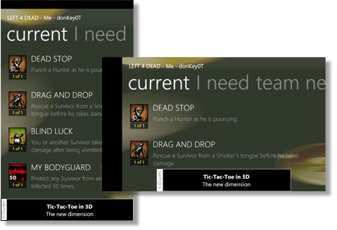
The released achievement list pivot design, portrait and landscape
Working with what you've got
Clicking on an achievement takes you to a detail of that page, offering a longer description plus a list of those in your team who have obtained that achievement, and those who have it outstanding. It would have been nice to do a little more with the image here, but the original images are of thumbnail size and increasing that to the size displayed on the final app is already pushing the resolution somewhat and causing some blurring to occur, so I felt a little limited.
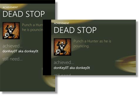
The released achievement detail page design, portrait and landscape
Be obvious or allow for exploration?
The other feature the app offers, is the ability to create teams. This posed a multitude of dilemmas, both for the iphone app and the WP7 version. Trying to keep the process simple, allowing as much content to flow into the limited real estate of a mobile device screen AND providing an engaging amount of functionality, proved quite a challenge. There were four main options to present the user with from the team page - to change the current team, add a team, edit a team or delete a team. We risked adding a number of buttons or links or extra screens to cover all these options, when really it made sense to make these contextual. We supplied a button for adding a new team, as that takes you off to another screen to enter details, but we wanted to use the list entry itself to trigger the changes. With this in mind, we decided to allow the user to change the team simply by selecting from the list. However, how do you then allow the user to edit a team from the list?
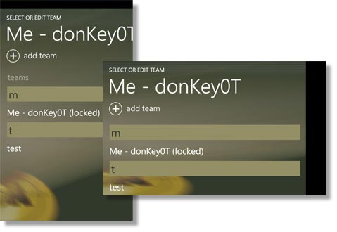
The released team page design, portrait and landscape
We plumped for a context menu in the end. There is a bit of a risk using this method, as it requires the user to hold their finger down on a list item for some time before the context menu appears and gives you option to edit or delete. There is an element of discovery here for the user - it's not instantly obvious. We did dither about this for some time and sketched the idea out to get people's opinions (which tended to be split!).
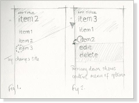
Sketch to represent how the context menu works
A little animation
The other slight issue with the UI on this page, was how the change of team is indicated. The current team name forms the page title. When another team is selected, the title change accordingly and sets the new team to be the curren team. This can escape attention, especially if the new team name is of a similar length in characters to that of the current team. To make this action to the event more obvious, we introduced an animation to try and draw the eye to the title and emphasise the fact that something on the page has changed. I simply did this in Blend by creating a Storyboard that captured a change in the title's scale (via the transform tab) and opacity. This just gives a kind of pulse effect to the title as it changes.
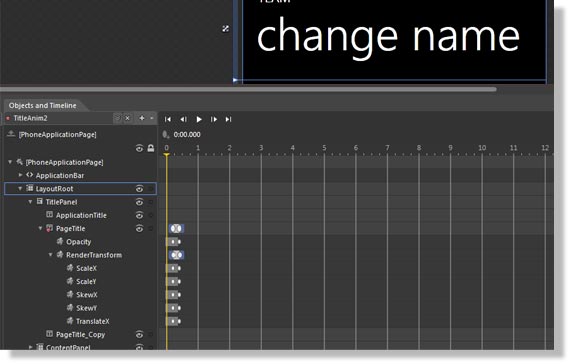
Using Blend to create a storyboard to animate the title, to emphasize a change in team
See the Light (theme)
We felt it important not to lock the app into the dark theme and allow the user to change to light if required. Personal preference aside, there are times when an alternative theme is simply useful. In certain lighting siutations, a light theme might perform better than the dark and visa versa. Because I'd used tints and amended colours here and there, I had over-ridden the phone's system resources. Therefore, we had to intervene to ensure that a light theme alternative would be legible.
We separated all our colours and background brushes, template styles etc out into separate resource files where appropriate. The sheerly superficial elements - colours and background brushes were stored in a light.xaml and dark.xaml files, acting very much as a CSS file would for a web page. By referring to these files in the App.xaml file, the phone moves between the resource files as the themes are changed.
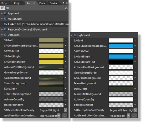
Creating two resource files to generate a Light and Dark theme
I kept the background very simple, just introducing the Steam medal device as a brushstroke of the branding. We could have maintainted the gold colour that exists in the dark theme to extend the branding, but decided to allow the light theme to be accent colour-friendly as there was no fear of clashing with any other strong colours. We simply did this by referring to the phone's system resources in the Light.xaml theme.
The basic Light theme version, also accent colour-friendly. Just a hint of the branding is referred to via a neutral background image
A few more points
At the risk of banging on too long, I thought I'd scrunch in a few additional points we learned/observed along the way.
Firstly, just a little about how we worked. We didn't really have any formal version control going on, we worked closely together but actually worked independenlty on files. As Paul was working on the functionality, I would work in parallel on how the screens would work in Blend. When we got to a stage when we felt it appropriate, we merged our work using a file comparisson tool (in this case, WinMerge). We did this periodically, working on the newly-merged file until our tweaking required another merge. This did seem to work quite well, especially as we tried to exploit resource files for much of the 'superficial' styling, thus limiting the impact on the page xaml.
Just a word, also, to say that I increasingly built directly to the device rather than to the emulator as the project progressed as I found that tweaking the finite detail was something that really required testing on a device -this allowed you to see where gradients might not look great or that hot spots weren't quite working in certain positions and so on.
Always bear in mind the context of use. We rejected using an animated start screen as we felt it would become irritating very quickly. Quite cute the first time you open it, but it simply delays you getting in to use your app, and getting out again. Obviously this depends on the app - in certain situations this is perfectly acceptable, if not desirable, but it's worth giving some thought to when you use animations (performance aside) and when it's best to hold back.
And finally, testing. Just be prepared that even if you do give out your app to people ahead of release and ask for feedback, it's often not until after release that people do provide this. We certainly found this with the iphone version. You can't ever rest on your laurels!
For more information on Steam Achievements for iphone or Windows Phone 7, visit the Steam Achievements website.
If you found this write up interesting, you might also like to take a look at designing the tile and application icon for Steam Achievements or my experiences designing for Windows Phone 7...
If you liked my approach to Steam Achievements and would like some design input for your WP7 app, then please drop me an email to find out my availability etc.
Return to site