design
My experiences designing for WP7
I've been dabbling with some design for WP7 and thought I'd document some of my thoughts and experiences so far. I've been working with a developer to re-work a current iphone app and also just mocked up a personal project as a bit of extra practice. Being a designer I've been using Blend as I have very little knowledge of all things code, if it ain't HTML or CSS. I've come up against the usual issues when designing for a mobile device - working within a small real estate, condensing things down to they're simplest, barest essentials etc. But I've encountered a few dilemmas that have arisen from attempting to conform to guidelines on both user experience and visual design.
It's been a kind of weird experience working with Blend and having exposure to such extensive design guide materials. On the one hand, we have fantastic Photoshop files to help us work correctly with the controls, yet it's sooo easy to pull them apart in Blend and re-work them ourselves as designers. Blend can do it all for you - you can drag and drop all the controls onto workspace and they will be designed in accordance to the native look and feel and UX. So what's left for us visual designers to actually do??
We can bung in a background image here and there, re-work spacing/scale etc to a degree so that we maintain an appealing page composition, maintaining the essence of the metro design, but how much do we change? The metro design doesn't lend itself to gradients. It's all about clear typograpy, solid colours, clean lines etc, reminiscent of Swiss typography. This is one of the reasons it looks fresh in comparison to the glassy, shiny icon feel of the iphone. However, how do we convey a sense of brand and identity to our apps?
There are small brushstrokes you can make that help offer a sense of the brand - whether that's flashes of colours, background colour etc. I, for example, was designing an app that is aimed at gamers. I had an idea of subtly linking it in visually with a website that provides the data for the app - one that potential users would be familiar with. I also wanted to create a feel a bit like a game HUD - where you find textures, layers of glassy UX assets etc. But this doesn't really lend itself to metro. Quite correctly, space, type weight and scale aid the layout - the content is key. But will users that are used to a feel of texture and suggestion of 3d feel a little alienated from this look and feel if it's forced on every app for every occasion? Is it appropriate that every app has this same approach, with maybe a slightly different colour used here or there or background image? And does it run the risk of becoming the new (but infinitely more elegant and well-designed!!) grey winform of the future? You know a designer hasn't been near this app because it has the out of the box white on black feel.
My gut feel is that designers will push the boundaries. They may respect the thinking behind metro, but will ultimately strive to create something different, something that makes their app unique. We see it already, and it's probably the bigger players with the greater desire to visually promote their brand, that will push it the most. The start icon is a perfect example of this. Very few apps have icons that are in-keeping with metro's vision. Very few are vector-based, flat 2-colour white on the accent colour. This gave me a massive dilemma. In fairness, you create a stylised icon that fits into the phone's native suite and it is hard to pick it out at a glance. Apps that use halftones, full colour etc break the unity of the content list, but are instantly recogniseable. In true Harry Hill style, I want to design a clean icon that's in keeping with metro's and respect the noble intentions of a well-designed system, but I want my icon to be easily recognised by my user. Ultimately it's FIGHT. Do we compromise in some way? Ditch the negative space accent colour but create a white icon? Use a full colour foreground and allow for the accent colour to change? I really don't know! Whatsmore, how do you convince a client to conform? That is only going to get harder if apps come out that do flout the guidelines. And lo, the guidelines become lost and app design becomes a free for all.
This leads me to another dilemma - themes. I tend to think of themes in a similar way to fluid web design. A noble attempt at allowing users to have control over their ux. They can decide whether they wish to view light text on dark or visa versa. They can also personalise their phone further by selecting accent colours. Really nice idea of offering some user control. However, for developers the reality is that unless you stick to the out of the box controls, having to deal with these changes becomes a little painful. If you use a background image and the theme changes, chances are the text will become illegible. So you have to think about creating another background image in an inverted colour to accommodate. In the meantime, you have to check that every theme colour will work with your designed colour scheme. All this is additional design/development cost.
So say you painstakingly stay loyal to the metro style, you accommodate all the theme/accent combinations and have toned down any amount of branding to a minimum. You then find that there are other successful apps out there that have decided to override the option to change theme and accent changes & you wonder why you bothered to do so. Most users will probably not even notice that when they select a list item, the text changes to a colour sympathetic to the app's look and feel rather than their chosen accent colour. I think generally a user accepts that once in an app, you're in that domain. You expect the thing to function and follow certain usability conventions native to the device, but there are certain things that a user will accept.
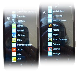
Oh and one thing I think that really will get dropped quickly (and probably already has) is the title area. As much as I like the indulgent size of the type, from a practical perspective, it does take up a considerable amount of the vertical space.
So what am I going to do? Well I guess my view is that I need to understand the rules and only break them in a considered way. Make a conscious decision to do so if I deem it important to the app and it's users. I will undoubtedly make some mistakes along the way - this is all pretty new to most of us and we have to feel our way through it. The important thing I guess at the moment is just to make stuff and get it out. Too much concern over what is the correct thing to do and the right approach to take, can result in total paralysis. I guess we just have to get stuck in, understand the guidelines and respect them and adopt the essence at every opportunity and see where it takes us!
Find out how I got on designing the screens for the Steam Achievements Windows Phone 7 app
and here's a write-up of designing the icons for Steam Achievements Windows Phone 7 app
Return to site