design
Designing an icon for a WP7 app
I've been working on an app that was released for the iphone a while back and is now undergoing the WP7 treatment. I didn't have much involvement with the iphone version, but did create an icon for it and a small website (rapidly put together!) to support it.

Re-working an existing iphone icon
The challenge has been to create an icon that reflects the 'branding' of the existing app, and apply it to the metro design. The path of least resistance is to re-work the existing icon to accommodate for the sizes required. However, I wanted to play with the shape, reflect the medal design of the website to a greater degree and see how the icon might fit with the designs for native apps.
The requirements
The big decision to reach with the icon design, is whether to keep rigidly to the branding of the app or whether to remain sympathetic to the native design. The icon is there to instantly identify an app at a glance. It therefore needs to appear sufficiently different to other icons that it can be picked out from the crowd. But does that mean it shouldn't also compliment the essence of the native design? The other aspect to bear in mind is that an icon that does compliment the native apps is likely to convey quality to the user and instil confidence that the app is well-considered.
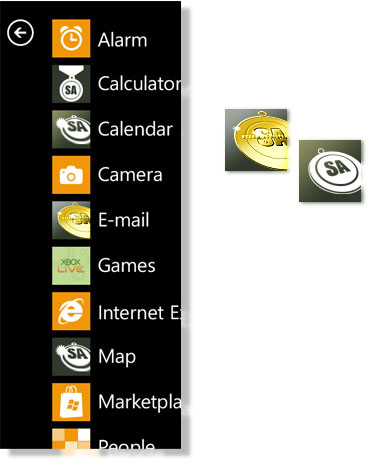
I wanted to develop the icon more from the website banner design than the iphone icon as I was already looking to simplify the shape and create a shape that was a little more dynamic as it wasn't going to receive the shiney, glassy treatment of the iphone version. I tried a few out, using the background colour of the app and dropped them onto an example app list as supplied in the photoshop files Microsoft supply (available at http://msdn.microsoft.com/en-us/library/ff637515(VS.92).aspx).
Theme considerations
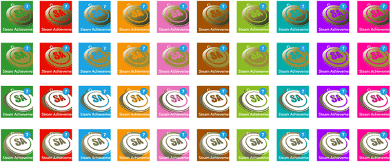
I played around with both a halftone full colour version and some flat, white versions, more in-keeping with Metro. I then considered how a start tile might look. I wanted to consider some way of incorporating the theme colour, yet retaining some of the app's own colour identity. (I even returned to a full colour version and played with the idea of the medal ribbon allowing the theme colour to appear!)

The other issue I am conscious of, is how the app appears when the icon is selected. If the app looks radically different to the icon that introduces it, then the experience is likely to jar. I therefore kept in mind the splash screen that was to follow and worked on that in parallel. I looked at how I could introduce a hint of the app default background colour and looked at applying it to the various theme colours.
To conclude
My decision to date is to run with the icon below for the app start screen and retain the background colour (where the tile version loses impact at the small icon size) for the app list version.

The issues that I think arise from my first encounter with designing an icon for WP7 is whether to be rigid to the brand or rigid to metro: whether compromise works or whether it weakens a design. Whether quality is implied through retaining elements of native app design or whether such a design will be totally over- powered by full colour app icons to come. The other thing to bear in mind is that I was lucky enough to enjoy a lot of flexibility in my design, but other customers may not be quite as willing to see their branding colours and style adapted. It's early days and I think the jury's still out for me. I've reached a decision with my design development and I will see how that might change in time to come!
Find out how I approached designing the screens for the Steam Achievements Windows Phone 7 app
Return to site